
SCSS Corner Circle Cutout

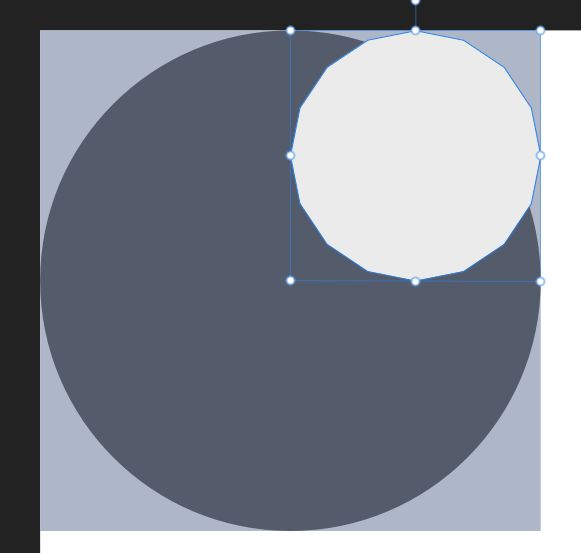
First let's take a look at what we are trying to achieve:

The simplest approach would be to give the icon in the corner a background-color and border-radius and that is also the solution I would suggest you use.
There is one catch though: the background-color of the corner icon and the background-color of whatever we place the container on have to match. If thats an easy thing you can guarantee, great! No reason to make it more complicated than it has to be.
But what if the container is placed on various different backgrounds or in parent elements with transparent background colors like rgba(255,255,255,0.5)? Syncing the corner icon to every possible situation can quickly become annoying.
Another example would be an image as background:

Pathfinder
I opened up Affinity Designer to generate a quick sketch, instead of a circle I chose a polygon so we don't have to deal with too many coordinates:
After merging the outer square with the polygon, I saved the svg and copied the path of the shape into https://yqnn.github.io/svg-path-editor/
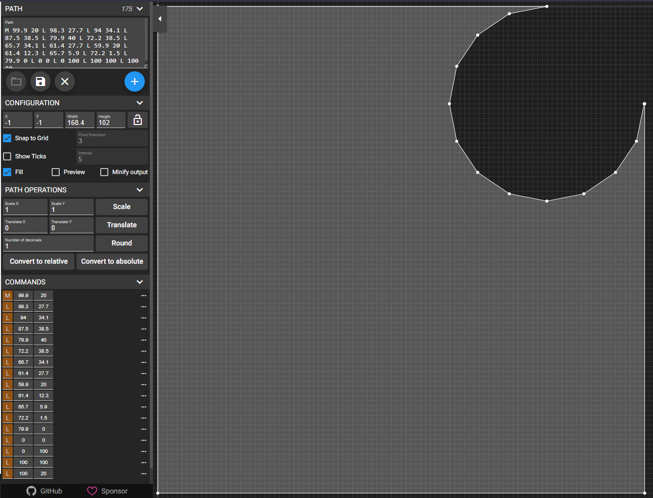
This is the clip-path we we put on the container.
To get the points as clean coordinates I used the "Convert to absolute" and "Convert to > Line to" commands. Because I created the shape with a size of 100px, I can use the values as percentages.
At this point we could put these values into a clip-path and we are done:
clip-path: polygon(
        100% 20%,
        ...
        0% 0%,
        0% 100%,
        100% 100%,
        100% 20%,
);
But since we are awesome and stuff is not complicated enough, let's make it configurable using scss and math.
Madness
Our mixin will take a variable $r with a default of 40% that means we have to express our percentages as values relative to $r :
20% becomes 0.5 * $r
40% becomes $r
and so on..
And ecause the circle is right-aligned the values need to be relative to the right edge (x 100%) for them to scale correctly:
80% becomes 100% - 0.5 * $rThe finished scss mixin
@mixin circleCorner($r: 40%) {
    clip-path: polygon(
        100% 0.5000 * $r,
        (100% - 0.0425 * $r) 0.6925 * $r,
        (100% - 0.1500 * $r) 0.8525 * $r,
        (100% - 0.3125 * $r) 0.9625 * $r,
        (100% - 0.5025 * $r) 1.0000 * $r,
        (100% - 0.6950 * $r) 0.9625 * $r,
        (100% - 0.8575 * $r) 0.8525 * $r,
        (100% - 0.9650 * $r) 0.6925 * $r,
        (100% - 1.0025 * $r) 0.5000 * $r,
        (100% - 0.9650 * $r) 0.3075 * $r,
        (100% - 0.8575 * $r) 0.1475 * $r,
        (100% - 0.6950 * $r) 0.0375 * $r,
        (100% - 0.5025 * $r) 0%,
        0% 0%,
        0% 100%,
        100% 100%,
        100% 0.5000 * $r,
    );
}